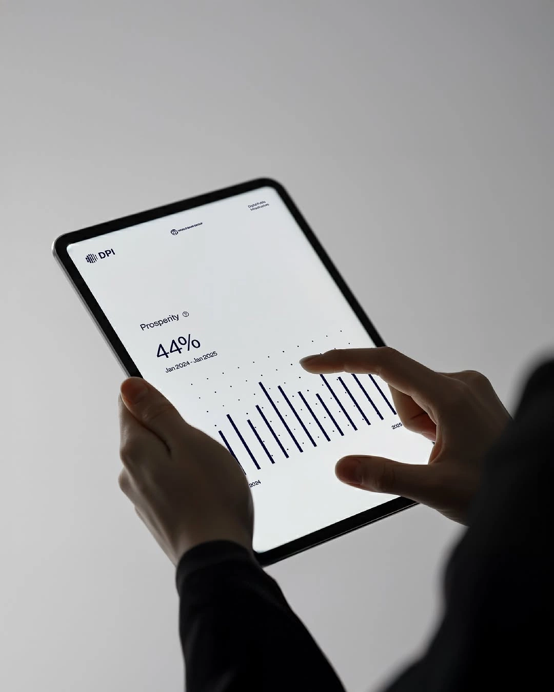
- #Web design
- #UX
- #Development
Pulse Website
A marketing site for a payments startup, rebuilt from wireframes to launch so the product explains itself in the first scroll.
Client:Pulse Pay
Year:2026
Timeline:10 weeks
The challenge
Pulse had a product people loved and a website that buried it. We mapped every question a finance lead asks before booking a demo, then designed a site that answers them in order.
Three audiences, one homepage, and a sales team that needed qualified demos rather than more traffic.
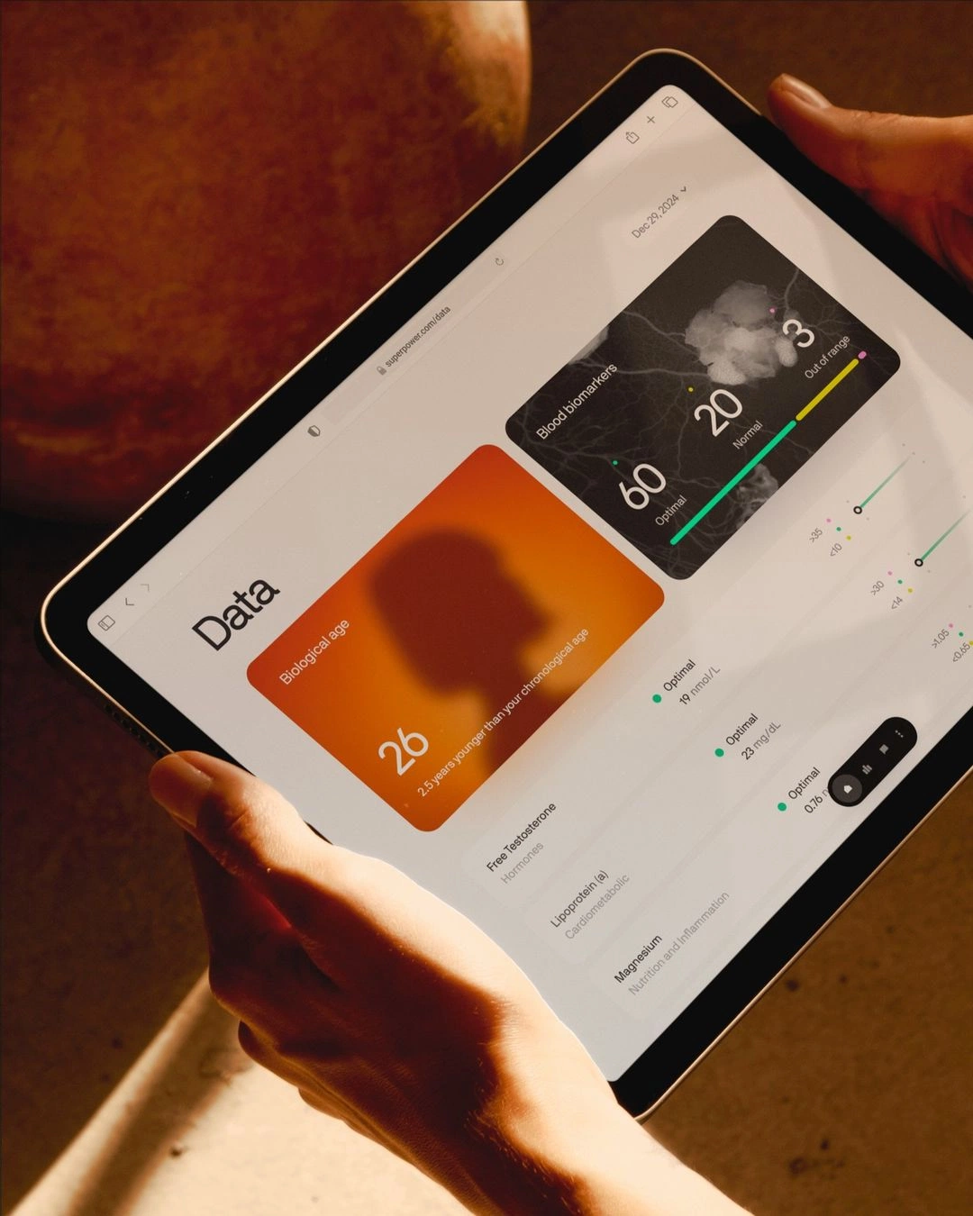
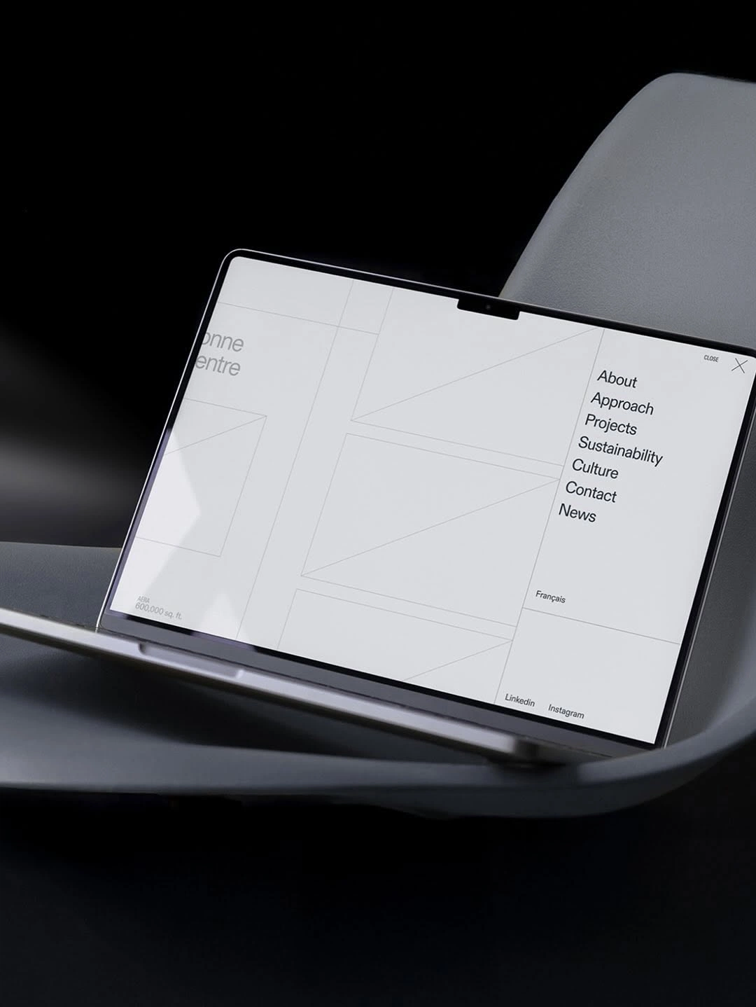
Our solution
A modular page system with role-based paths, live product previews and a demo form that routes leads to the right rep.
- 01Web design
- 02UX
- 03Development
Key results
- 2.4x – More demo requests
- 38% – Lower bounce rate
- 10wk – From kickoff to launch
“Tracy turned a confusing product into a site our buyers actually read.”