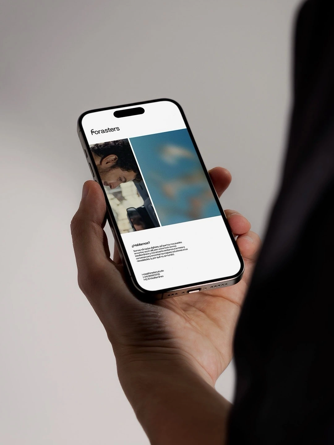
- #Brand strategy
- #Logo design
- #Identity system
Northwind Identity
A new mark and identity system for an outdoor brand moving from wholesale to direct-to-consumer.
Client:Northwind Outdoor
Year:2026
Timeline:8 weeks
The challenge
Northwind's old logo was built for a catalogue page. The new identity had to work on a product tag, a storefront and a 16px browser tab.
Keep thirty years of recognition while looking at home next to digital-first competitors.
Our solution
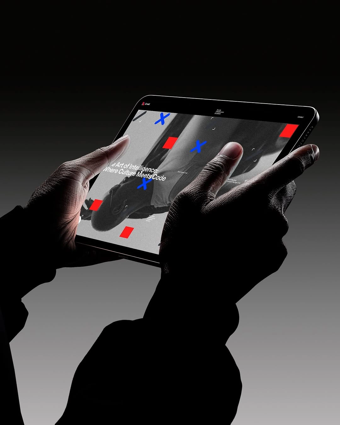
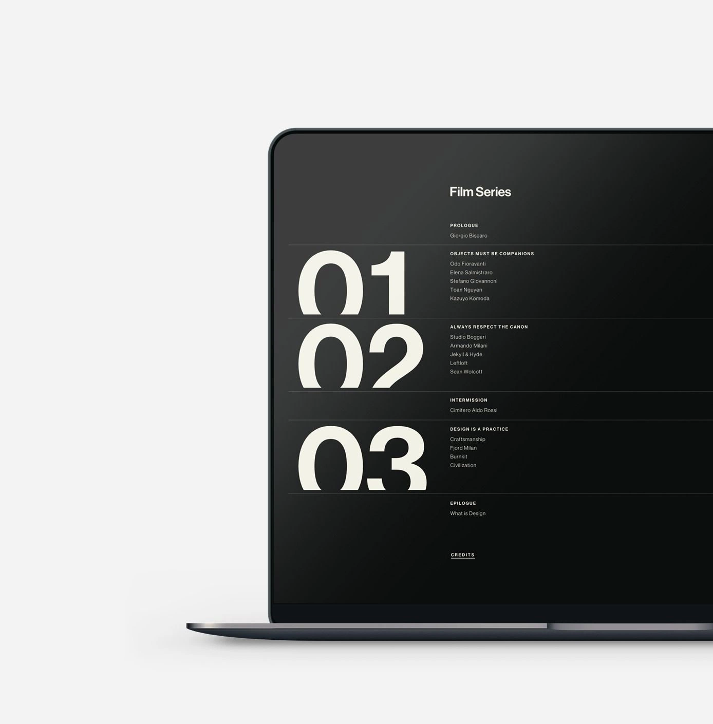
A simplified compass mark, a bold condensed wordmark and a flexible colour system drawn from the brand's original palette.
- 01Brand strategy
- 02Logo design
- 03Identity system
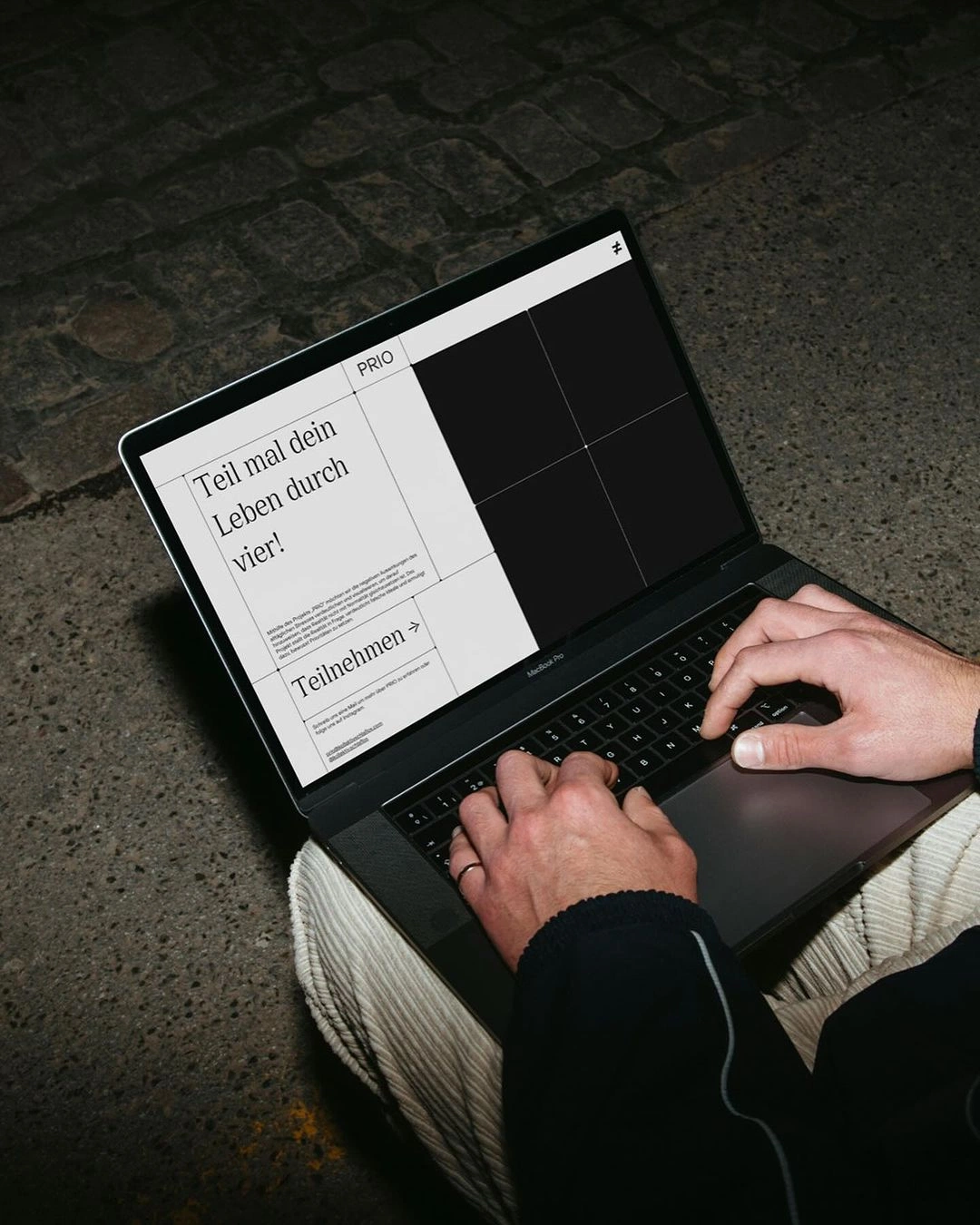
Key results
- 41% – Higher brand recall
- 120+ – Assets in the system
- 3x – Faster asset production
“The new mark feels like us, only sharper. Our team finally has a system they enjoy using.”